
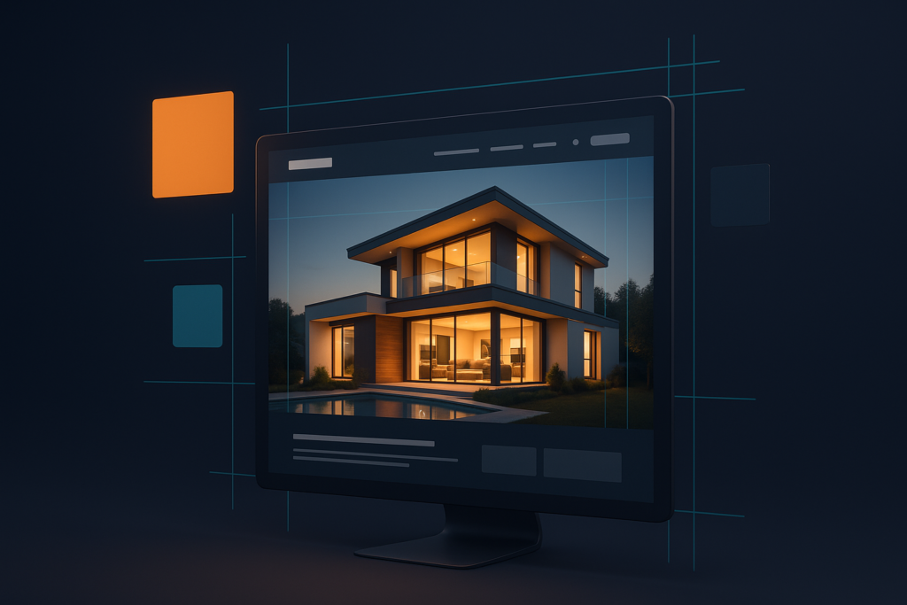
First impressions happen in milliseconds. Before a buyer reads a single word, they’ve already judged your brokerage by how your website looks — and decided whether to trust you with the biggest transaction of their life. In real estate, where the product is aspirational and emotional, design isn’t decoration; it’s credibility. So what separates the best-looking real estate websites from the forgettable ones? It’s not luck or random taste. Great real estate web design follows a handful of clear, repeatable principles. Here’s what makes a real estate website genuinely beautiful — with ideas and inspiration you can apply to your own.
1. Big, Beautiful Imagery
The best real estate websites lead with stunning, full-width photography — ideally real listings and real local scenery, not stock photos of skylines that could be anywhere. Imagery is the emotional hook of real estate, so the design should let it breathe at full size. On the strongest sites, the hero photo is an actual home for sale, pulled live from the MLS, so the site always feels current and never shows a property that sold months ago. Big, confident imagery instantly signals that this is a brokerage that takes presentation seriously — exactly the impression you want a seller to have about how their home will be marketed.
2. Clean Layouts & Generous Whitespace
Cluttered sites feel cheap and overwhelming. The most elegant real estate websites use plenty of whitespace, a clear visual hierarchy and a calm, uncluttered grid that guides the eye naturally from headline to photo to call-to-action. Whitespace isn’t wasted space — it’s what makes the photography and listings feel premium and gives the design room to breathe. When everything competes for attention, nothing wins; restraint is what makes a luxury brand look like a luxury brand.
Design tip: If a section feels busy, the fix is usually to remove elements, not rearrange them. Fewer, larger, better-spaced pieces almost always read as more expensive than a dense grid of small ones.
3. Strong Typography & a Cohesive Color Palette
Great design lives in the details. A refined serif paired with a clean sans-serif instantly signals quality and sophistication, while sloppy or default fonts undercut everything else on the page. A tight, consistent color palette — often a deep, confident neutral plus one or two accent colors — ties the entire brand together across every page. That consistency is what makes a site feel intentionally designed rather than assembled from a template, and it carries through to your business cards, yard signs and social media for a brand that feels unified everywhere buyers encounter you.
4. Search Front and Center
The best-looking real estate sites are also the most usable. A prominent search bar or interactive map — right in the hero, above the fold — tells visitors exactly what to do first and gets them into your listings immediately. Beautiful and functional are not opposites; the strongest designs make the single most important action the most obvious one on the page. A gorgeous site that hides its search is a failure of design, not a triumph of it.
The home search bar is the “buy button” of a real estate website. On the best sites it’s impossible to miss — large, centered, and waiting in the hero the moment the page loads.
5. Flawless on Mobile
A site can look gorgeous on a designer’s 27-inch monitor and fall apart on a phone. Since most buyers browse on mobile — frequently while standing in a driveway or scrolling in bed — the best real estate websites are designed mobile-first. That means thumb-friendly buttons, fast-loading images, readable type without pinching, and a search experience that’s just as elegant on a six-inch screen as on a desktop. If you only check your website on a laptop, you’re seeing the version most of your visitors never will.
6. Thoughtful Motion & Detail
Subtle touches — a gentle image zoom on hover, smooth scrolling, tasteful fade-ins as you move down the page — make a site feel modern, alive and polished. The key word is subtle. The best design enhances the content and rewards attention without showing off or slowing things down. Heavy animations and gimmicks do the opposite, making a site feel dated and sluggish. Restraint, again, is the mark of good taste.
Real Estate Web Design Trends for 2026
Design evolves, and a few directions define the best-looking real estate sites right now:
- Editorial, magazine-style layouts that treat listings and neighborhoods like featured stories.
- Moody, sophisticated color palettes — deep navies, warm neutrals and gold or muted accents over the old bright-blue-and-white look.
- Full-bleed video and live photography in the hero for instant impact.
- Interactive maps as the centerpiece of the search experience.
- Bold, oversized typography used as a design element in its own right.
Beautiful, But Not Just Pretty
Here’s the catch every agent should understand: a gorgeous website that ranks nowhere and captures no leads is still a failure. Looks earn the click and the trust, but they have to be paired with speed, MLS integration, local SEO and lead capture to actually grow your business. The best-looking real estate websites are also the best-performing ones — the beauty and the function are designed together, not bolted on separately. (We break down the performance side in detail in what makes a good real estate website.)
The best-looking real estate websites aren’t just pretty — their beauty makes the home the hero and the next step obvious.
Inspiration: A Real Example
For Apex Realty, we paired an elegant serif-and-sans type system with a deep navy palette, full-width live MLS photography and a search-first hero — design that looks high-end and drives action. Every listing photo updates itself live from the MLS, so the site never looks stale, and the whole experience is built to be just as striking on a phone as on a desktop. It’s proof that you don’t have to choose between beautiful and effective. The best sites are unmistakably both.
Want a Real Estate Website That Turns Heads?
Elevated Ideas designs custom, on-brand real estate websites that look stunning and perform — beautiful design with MLS integration and lead capture built in. Let’s design yours.
Custom WordPress design • IDX/MLS integration • Local SEO built in • Central Illinois
Good To Know
Real Estate Website FAQs
What makes a real estate website look professional?
Big, high-quality photography, clean layouts with generous whitespace, refined typography, a consistent color palette and a search bar front and center. Real local imagery instead of generic stock photos makes an enormous difference, as does flawless presentation on mobile.
Should a real estate website be dark or light?
Either can look stunning — it depends on your brand. Dark, moody palettes feel luxurious and high-end, while light, airy designs feel fresh and approachable. What matters most is consistency and letting the property photography be the star. The wrong choice is no choice: a muddled, inconsistent palette.
What are the current real estate web design trends?
In 2026 the best-looking real estate sites lean on editorial magazine-style layouts, sophisticated moody color palettes, full-bleed video and live photography, interactive maps, and bold oversized typography. The throughline is restraint and letting big, real imagery carry the design.
Do good looks actually matter for a real estate website?
Absolutely. Visitors judge your credibility in milliseconds based on design, and in real estate that judgment shapes whether a seller trusts you to market their home. But looks alone are not enough — the best sites pair beautiful design with fast performance, MLS integration and lead capture.
Can you design a custom-looking real estate website for my brand?
Yes. Elevated Ideas builds fully custom real estate websites designed around your brand — no cookie-cutter templates — that look great and are built to convert. Reach out and we will put together a design direction tailored to your market.